Tuesday 29 October 2013

The New Elizabethans - As seen through Fashion, Hair and Make-Up


Edward Bond ‘The Third Crisis: Drama and Civilization ’
“The first Elizabethan age ended with the discovery of brave new worlds (and incidentally the joining up of the United Kingdom). We are certainly on the edge of vast new unprecedented worlds, cosmic changes in culture, economy and society (and ironically the possible dissolution of the United Kingdom). But are our new worlds brave, cowardly, explorative or degenerative? It could be said the old Elizabethans plundered the new worlds. Perhaps now we can only plunder ourselves and call it trade."

In response to the above quote, I researched some public figures that I feel represent the idea of a New Elizabethan age through their fashion, hair and make-up styling.
http://www.refinery29.com/2013/02/42663/beyonce-mrs-carter-tour-dates-2013

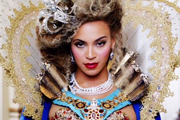
Beyoncé's recent The Mrs Carter Show World Tour is a perfect example of a new Elizabethan fashion.  The styling that she used to portray herself was a very contemporary idea of an Elizabethan themed look.  Her paler than usual skin tone and rouged lips and cheeks replicate the iconic idea of an Elizabethan make-up and her hair is also done in an up style, which was also a classic look during the Elizabethan era.  Beyoncé's high neck collar is a modern interpretation of the Elizabethan fashion, as they always had big ruffs and collars surrounding their necks.  Overall, I think that Beyoncé's look here can be easily defined as a new Elizabethan, with the fact that she has taken some of the most iconic make-up and fashion styling from the era and used them to portray herself as 'Queen of the World' to advertise her tour.  The colours that Beyoncé has chosen to wear are those that would have been worn by the higher class civilians of society, portraying again the idea that she is a powerful woman.
Beyoncé is also a New Elizabethan in the fact that a lot of teens and women around the world look up to her as a style icon.  This is similar to how many women of the Elizabethan era looked up to Queen Elizabeth for style inspiration when making themselves up.


http://anjuthreads.com/eb-kate-middleton/
Another New Elizabethan as seen through fashion, hair and make-up would have to be Kate Middleton.  Her style is not very Elizabethan at all, however she is a style icon to many women, especially in Britain.  Kate's style is always very sophisticated in a modern way, as Elizabeth's was  during the era.  She also makes her looks very accessible to others, through shopping in a lot of high street stores.  Also through wearing more subtle make-up, Kate makes herself appear more relatable to everyday women unlike celebrities such as Lady Gaga, who try to be wild and 'out there' so as to separate themselves from the rest of the public.  I think that Kate Middleton is a very different style icon to Beyoncé, yet nonetheless still a New Elizabethan through her inspirational styling that so many women try to imitate.


http://ioet.com/index.php?/plugin/tag/books


Other examples of a new Elizabethan age within fashion, hair and make-up can be found through contemporary make-up and fashion styling images.  The above are both great examples as they replicate and use the classic pale face and darker lip look.  In the second image, the idea is taken further here with the styling of the big ruff on the dress.  Both styles have again considered the colours that they have used and what they would have represented in the original Elizabethan era.

Friday 25 October 2013

Colour Theory Face Charts

After this weeks 'Colour Contour' workshop, we were asked to create four face charts using the colour theories that we learnt in the lesson; complimentary, monochromatic, analogous and neutral.

This face chart uses the idea of a COMPLIMENTARY colour scheme.  A complimentary colour scheme works with two colours that are opposite on the colour wheel.  For this face chart I chose to focus my look around the colours yellow and purple.  This design uses the Sleek Original palette on the eyes to create a contoured eyeshadow.  It also used Illamasqua Powder Blusher, Ambition on the cheeks and Kryolan Lip palette, LC010 on the lips.  This look is completed with a thin line of eyeliner on the eyelid and a small amount of black mascara.
I think that this design works quite well and I like the colours that I have used.  The reason that I chose these colours initially, was because purple and gold were seen to be colours worn by the wealthier Elizabethans of the era.  I think that this design could possibly work as one of my final designs, if I were to make the face paler and possibly even whiten out the eyebrows.

This face chart uses the idea of a MONOCHROMATIC colour scheme.  A monochromatic colour scheme uses the idea of just one colour, but different tints, shades and tones of that colour.  For this face chart I decided to go with the colour red, as it is a colour that really pops and brings out the features nicely.
The products that I used on this chart were; Illamasqua Cream Blusher, Libido on the cheeks, Kryolan Lip palette, LC005 on the lips and the Kryolan Aquacolour palette on the eyes.  I like this design and the way that the brush strokes are quite flicky, but harsh at the same time.

This face chart uses the idea of an ANALOGOUS colour scheme.  An analogous colour scheme works with three colours that are next to each other on the colour wheel.  For this chart, I have chosen to use pinks and reds.
The products that I have used are; Sleek Original palette on the eyes to create a contoured eyeshadow effect, Illamasqua Powder Blusher, Tremble for the cheeks, and Rimmel London Lasting Finish Lipstick, Tantrum.  This look would be completed with a small touch of eyeliner and mascara on the eyes.
I quite like this design, as I didn't think that pink and red would work so well together on the same chart, however the reds that I have used are more pinky anyway so it does work fairly well.

This face chart works with a NEUTRAL colour scheme.  For this look, I have used products such as Sleek  Au Naturel palette for the eyes, Illamasqua PowderBlusher, Disobey on the cheeks and Kryolan Lip palette, LCP694 for the lips.
This look is created through a classic make-up look, with a contoured  eye and face shape and simple filled in lip colour.  I do like this design, however if I'm thinking forward about my final designs, I wouldn't use this one.  This is because I feel that a neutral colour look is more contemporary than Elizabethan.  I could make it more Elizabethan by making the skin paler, however I don't think it would be as effective and it wouldn't make my features pop like other colours could.

My favourite face chart of the four above has to be the monochromatic face chart.  This is because I really like the brush strokes that I have created when applying the make-up, especially the shape of the eye make-up and blush.

Wednesday 23 October 2013

Colour Theory & Colour Contouring

http://forum.tis.edu.mo/grade1/
COLOUR THEORY
Colour theory creates a logical structure for colour which is useful, particularly to us as make-up artists. There are three basic categories to understanding colour theory; colour wheel, colour harmony and the context of how colours are used.

COLOUR WHEEL: this is split into three categories.
- Primary colours; red, yellow and blue.  These are known as the foundation colours because all other colours are created from them.
- Secondary colours; orange, green and violet.  These are a combination of two primary colours.  For example, if you mix red and yellow together, you will get orange.
- Tertiary; yellow-orange, orange-red, red-violet, violet-blue, blue-green and green-yellow.  These are made by combining a primary colour and a secondary colour adjacent to it.
                                : it is also divided into warm and cool colours.
- Warm colours; such as oranges and yellows.  Described as passionate, bright and aggressive colours.
- Cool colours; such as blues and greens.  Described as more soothing and calm colours.
HOWEVER red can be either warm or cool, depending on whether or not it has an orange or blue undertone to it.

HUE - this is another word for colour
TINT - you create a tint of a colour by adding white to the pure hue
SHADE - you create this by adding black to the pure hue
TONE - a tone is created by adding grey to the hue

TRIAD & TETRAD COLOUR SCHEMES:
A triad colour scheme is made up of three colours that are equally spaced apart from one another on the colour wheel.  For example the primary or secondary colours would create a triad colour scheme.
A tetrad colour scheme is made up of four colours on the colour wheel that are two sets of complimentary colours.  For example violet, yellow, blue and orange would create a tetrad colour scheme.


COLOUR CONTOURING
In this week's seminar with Lara (our lecturer) we had a workshop called 'Colour Contour'.  In this workshop we looked at contouring the face using two complimentary colours; the darker colour for shading, and the lighter colour for highlighting.  We also had to add tints, shades and tones to areas on the face, however I ran out of time when working on my model, so I just have the basic shades and highlights of the face.
I really enjoyed this week's seminar and working with the different colour theories, because it was a good and interesting way to look at contouring the face.  It also allowed us to see more definitely where things should be highlighted and shaded.
Below are pictures of Lara's demonstration and my own attempt at the colour contouring.

Friday 18 October 2013

The Make-Up Studio - HIGHLIGHTING & CONTOURING

HIGHLIGHTING & CONTOURING is important when making someone up.  This is because it gives a person's face a lot more shape and structure.  Below is the equipment, method and technique used when shaping a person's face.


Equipment used:
Kryolan foundation palette
Primer
Kryolan concealer palette
Illamasqua loose powder
Illamasqua cream blusher, Libido
Illamasqua powder blusher, Tremble
Foundation brush
Buffing brush
Concealer brush
Powder brush
Contouring brush
Highlighter brush


How to apply CONTOUR and SHAPE THE FACE
Before highlighting and contouring the face you need to apply a base of foundation and concealer, as shown in week two.  However DO NOT powder, as grease based products cannot be applied over powder
For highlighting areas – use a foundation or concealer 2 shades lighter than your models skin tone
For shading areas – use a foundation or concealer 2 shades darker than your models skin tone
Where you concentrate the highlighted and shaded areas depends on your model’s face shape

o   MAIN AREAS FOR HIGHLIGHTING:
Above the cheek bone
Along the bridge of the nose
In the middle of the forehead just above the nose
Under the arch of the eyebrows
Middle of the eyelids
Under the eyes
Middle of the chin

o   MAIN AREAS FOR SHADING:
Under the cheek bone (use the line from the tragus to the corner of the lip as a guideline)
Sides of the nose
Along the jaw bone line
Around the temple


Once you have highlighted and contoured using the foundation and concealer shades, you can then apply blusher
To apply the blusher ask your model to smile and apply it along the cheek bone using the contouring brush
NOTE: if you are using a grease base blusher you should not powder the face until after you have applied it.  If you are just using a powder blusher then you should powder before applying this

Wednesday 16 October 2013

The Taming of the Shrew

http://rufussewell.tumblr.com/post
/7318528648
The BBC adaptation of Shakespeare's classic 'The Taming of the Shrew' (cleverly named ShakespeaRe-Told: The Taming of the Shrew) was originally shown on TV back in 2005.  It was set in modern day England, although had small details running throughout the drama within elements such as the styling that kept it linked back to the original era in which it was set; the Elizabethan era.

Throughout the drama the characters are shown with pale faces, as would have been worn in the actual era itself.  The buildings in which it is set are also quite similar to those that would have been around back then, tall and grand.  However the main scene in which you can truly see the references to Elizabethan attire is the wedding scene.  In this scene Katherine Minola is getting married to Petruchio. Katherine's dress is very Elizabethan, with a big collar and long sleeves; a true reflection of a traditional Elizabethan dress.  Petruchio, however, is the main focus in this scene with the outfit that he is wearing.  He shows up in a women's outfit; including fishnet tights, a mini skirt and boots.  Although the outfit is outrageous and not very Elizabethan at all, the colours and materials of his clothing are.  Wearing rich colours and a velvet robe over the top, it implies that he is a man of a wealthy background.

Tuesday 15 October 2013

My Journey with the Elizabethans - Using Egg Whites

During the Elizabethan era, they used lots of weird and wonderful things on their face to do things to their skin such as tighten it.  In our seminar this week, we had a workshop called 'Base application to the Extreme'.  In this seminar, we looked at some of the products that Elizabethan women would have used on their face and we then got the chance to have a go ourselves.  We were using egg whites and tempura powder on the face, as this was a common thing for Elizabethan's to do.  They used to use this to tighten the skin, creating a sort of face mask.
We began by applying just two layers of the egg whites to the face and it made my face feel really tight as it dried.  We then mixed a small amount of the tempura powder into the egg whites and applied another layer with that combined.  It was interesting, because when I took the mixture off of  my face, my skin did feel really smooth, as if I had just had a face mask on.  Applying the mixture evenly to the face was quite tricky.  I found that the powder clumped in some areas of the face where it dried quicker than other areas.  On the left is an image of my model with the egg whites and powder on her face.  Unfortunately it doesn't show up as well in the picture, as I didn't have enough powder within my egg whites to make it stand out more.
I really enjoyed this session and I found it a good insight as to how the Elizabethan's worked with the things that they had available to them to try and keep their skin beautiful.  When we were first told that we would be having egg whites on our faces, I didn't think that I would enjoy it, however it was really fun.

Queen Elizabeth vs Rihanna

I have chosen Rihanna to compare to Queen Elizabeth and how she is portrayed in The Spanish Armada Portrait.  I decided to compare Rihanna to Elizabeth, as I feel that they are both style icons in their own right; Elizabeth having been an icon for the women of her era, and Rihanna being a current icon for teens of the present day.  I also believe that the two of them are very powerful women, but how they portray that is very different from the other.


Clothing:
The way that both Elizabeth and Rihanna style themselves says a lot about them.  Elizabeth wears layers of rich fabrics and materials as well as a lot of jewels.  Her dresses have very puffy sleeves and big skirts, with a tiny cinched in waist area.  Queen Elizabeth was always shown wearing big neck ruffs as well.
Rihanna's clothing is quite a contrast to Elizabeth's.  She often wears very little clothing, and when she does cover up a bit more, the style of this clothing is often tight to the skin so that you can see her figure through her clothing.
Even though their clothing styles differ a lot, they still portray a similar message.  During the Elizabethan era, puffy sleeves, big skirts and tiny waists were the fashion and it was seen as a wealthy thing; if you wore dresses with big sleeves and skirts, then you were seen as a higher classed citizen of society.  In today's society, however, it seems that when people wear little clothing they are labelled with a nasty nickname, unless it is a celebrity that is sporting the minimal clothing.  With this in mind, I believe that Rihanna shows her status through her clothing, because by wearing less she is saying more.

Make-up:
Queen Elizabeth has a very pale complexion with a large forehead and very thin eyebrows that almost appear as though they are not there and she has rouged cheeks and lips.
Rihanna's make-up shows a more natural complexion, with slight colour on the cheeks, a darker eye and a pink lip.
In Elizabeth's case make-up was very important at the time, as the paler face you had the wealthier you were deemed to be.  For Rihanna and today's society, there is no particular style of make-up that will make people think you are better off than you actually because make-up today is used to allow people to portray themselves in whichever way that they feel comfortable.

Hair:
Queen Elizabeth hair curly red hair and is wearing her hair in an up-do.  Elizabethans often wore their hair up, as it was seen to reflect a wealthier society, like the pale face and make-up.
Rihanna's hair is long and a colour of brown through to blonde.  She is wearing it down and to the side in the image above, however she changes her hair all the time, like most people in today's society.  Like the make-up, today there is no particular hairstyle that will deem which social hierarchy you belong in, people just wear their hair how they please and how they feel most comfortable.


References:
http://www.historyonthenet.com/Lessons/elizabeth1/armada_portrait.htm
http://www.spillitnow.com/viewtopic.php?p=3534835

Monday 14 October 2013

Elizabethan Portraiture - The Ermine Portrait

http://www.gogmsite.net/the_late_farthingale_era_fr/minialbum_queen
_elizabeth_o/1585_ermine_portrait_by_nic.html

The Ermine Portrait was produced in 1585 by Nicholas Hilliard and can be found today at Hatfield House where it is displayed.  Queen Elizabeth I always sat for portraits and had many produced of her during her reign.  She had them produced in order to portray the image of herself that she wanted the public to see and view her as.  Many of her portraits hold small symbols within them, and the Ermine Portrait is no different to any other.

The symbolic references within this portrait include; the Ermine, the Sword of State and the Olive branch.  Each of them having their different references that the queen used to make herself appear more empowering and a better leader for the country:
     - The Ermine -
       The Ermine is an animal that symbolises royalty and in the painting you can see that it is wearing a small crown around his neck.  This is representing majesty and purity, therefore enforcing the idea that she was 'The Virgin Queen'.
     - The Sword of State -
    This symbolises justice, portraying the idea that Queen Elizabeth would have done, and did, anything to do right by her country and that she would bring justice where it needed to be served.
     - The Olive Branch -
       The Olive Branch is a symbol of peace, which I think shows the idea that Elizabeth wanted peace with other surrounding countries.

Her clothing within this portrait also shows off quite a bit about her:
     - The big puffy sleeves, high neck ruff and the way her hair has been styled up, all symbolise her power, authority and wealth.
     - The bigger and puffier clothing also makes her appear bigger and therefore makes her look more intimidating and powerful.
     - The numerous amounts of jewels also represent her wealth and state.
     - The black and white clothing and the background is another way of showing her wealth, as only really wealthy or royal people of the Elizabethan era would wear colours such as black, white, red or purple.  The fact that she is wearing these colours, is a way of reminding people just how wealthy and powerful she is.
     - The Three Brothers Jewel is also displayed in this portrait of the queen.  This jewel was a gem made out of three diamonds, set in a triangle shape around another diamond.  It was one of the queens favourites, and is also another small reminder of her state of wealth.

Finally, the hair and make-up in this image really pulls the portrait together and sums up Queen Elizabeth.  Her hair is worn up and off of the face; making her appear more serious and powerful.  And her make-up is quite plain; again, a plainer face implies someone who is more serious about their role in society.  Also her face and hands are fairly pale, which I know was the desired look during the Elizabethan era.  This was because how pale you were implied how wealthy you were.  Also paleness is a sign of purity, which is the look that the queen wanted to achieve, as she wanted to be seen and known as the 'Virgin Queen'.

Saturday 12 October 2013

The Make-Up Studio - BASE APPLICATION & SKIN CORRECTIONS


Equipment used:
Kryolan foundation palette
Primer
Kryolan concealer palette
Illamasqua loose powder
Foundation brush
Buffing brush
Concealer brush
Powder brush


SKIN TONES AND FOUNDATIONS
o   Fair skin – Ivory, light beige, warm pink or peachy foundation tones
o   Medium skin tone – Medium beige
o   Light brown skin – Light browns with warm tones
o   Medium brown skin tone – Light browns with orange tones
o   Olive skin tone – Dark beige or bronze foundation tones
o   Dark brown skin tone – Deep bronze with orange tones
o   Black skin tone – Dark golden bronze


How to apply FOUNDATION
Before beginning always wash your hands and put a gown on your model/client
Make sure your brushes are clean and your work station is set up ready to go
Match the foundation to your model’s skin tone, mixing different shades on the back of your hand and testing the colour on the jaw bone to get the best colour match.  Blend the other tested shades into the skin once you have found the correct match
Mix primer into the foundation on the back of your hand and apply to the skin using your foundation brush
Begin in the middle of the face and work your way out (starting at the nose and blending out to the hairline and outer face).  This gives a more natural look
Be sure to cover the face, ears and neck, all the way down to the neckline of your model’s clothing
Once you have covered the skin, buff the foundation in using a buffing brush to get rid of any lines made when applying the foundation and to give the skin a smoother effect
Once the foundation is applied and buffed, you will need to conceal any areas that may need it
Conceal around the eye and nose area to get rid of any dark circles or redness.  Also conceal any blemishes
NOTE: any corrective make-up using green, lilac or yellow shades of concealer should be applied before the foundation.  Any skin coloured concealers can be applied after the foundation
Use the small concealer brush to apply the concealer to the skin and then buff in with the buffing brush to get rid of any harsh lines
Finish off by powdering all of the skin covered with make-up.  This can be done by using a powder brush or powder puff
Powdering sets the foundation and be sure to powder lots around the eye area to stop any bleeding
Foundation application summed up:
-> Choose the correct colour
-> Check the colour matches on jaw line and that it matches the forehead too
-> Begin with a small amount around the nose area
-> Blend upwards into the hair line and out from the nose across the face
-> Buff all over the face, ears and neck